Basics
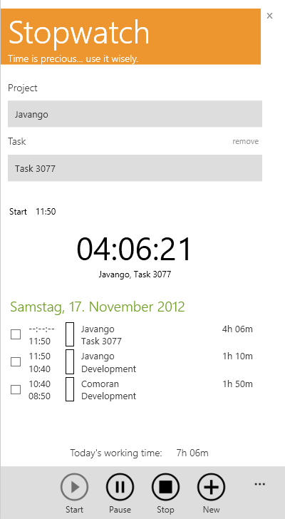
The TimePunch Watcher is kept simple and rely on the design principals of the new Windows 8 Style. The picture shows the different areas of the TimePunch Watcher.

Red – What needs to be done?
In this area one has to choose which project / task shall be done next.
Orange – What’s the current task?
This area shows the current project / task that will be tracked at the moment.
Green – What has been done?
This list contains all tasks of the current day. To that list naturally belongs the current task too that will be shown with an open end.
Blue – The command centre
Using the buttons at the lower area, the time recording can be started, paused and stopped. Additionally you will see other settings in the menu too.